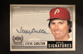
Inside the Pack: Best Practices for Taking Photos of Sports Cards
Maybe you’ve just started selling cards online for the first time. Perhaps you’re just looking to improve your sales. Whether you’re selling on forums, Facebook groups, or eBay, you can use these best practices to take better photos of your cards. In many cases photos are the first (and sometimes only) thing that captures a buyer’s attention, so better photos can help you get top dollar for your items.
- Take the card out of its case: A lot of people tend to leave a card in a penny sleeve, top loader, snap case, or magnetic case when taking photos. While doing so may convey a sense of care to the buyer, it also makes for a worse photo. Glare from the plastic can interfere with lighting, and scratches, scuffs, and dirt on the case could appear to be on the card instead.
- Use the correct lighting: Whether you’re listing from an office, your house, a garage, or any other place, lighting is one of the few elements you have complete control over. If you list from the same place consistently, find a setup and location in that space where the light accurately shows the color of the card but does not create a glare. You want to avoid the light being directly overhead, especially for chrome-type cards, or else you’ll end up with a reflection of the light on the card. A popular tool for lighting is a lightbox, which is a small enclosure that allows you to control the direction and intensity of the light source.
- Use different backgrounds as needed: Your background should be a solid color and should not contain any items (such as other cards) that are not included in your listing. I like to have access to three background colors: white, black, and silver/gray. Be mindful of what background you’re using for which card: a black bordered card on a black background makes the card look darker, and also may make it seem like there are flaws where there aren’t, as the light reflecting around the border of the card could like like chipping against a black border.
- Take front and back photos: Would you buy a car for which you’d only seen the inside? Would you buy a house just from looking at its curb appeal? A card has two surfaces, front and back. People who take a photo of the front only are effectively showing prospective buyers half of the card.
- Ensure photos are clear and close: I see far too many photos that look like they were taken while running past a baseball card. You aren’t going to run out of film with a digital or phone camera, so take as many photos as necessary to get one that’s clear. Don’t take a photo two feet away from the card, either. Buyers want to be able to see detail.
- Keep your hands and feet out of the photo: This is a huge pet peeve of mine: someone takes a photo of a card on a table or counter while standing next to it, and the photographer’s legs and/or feet are in the photo. Or, someone holds the card in their hands, allowing you to see every ripped cuticle and each speck of fingernail dirt. This is disgusting. You can crop any photo as you please, so keep your body parts out of them.
- Highlight any flaws in the photos: Too often I see a listing that describes a flaw like a crease or a mark or a stain, but there’s only one photo of the card and the flaw isn’t clear. It should be abundantly clear to the buyer what flaws, if any, or present. Soft corner? Take a close-up. Wrinkle? Catch the light correctly and take a closeup.
Sellers who use these easy tips will be more likely to get more money for their cards than those who don’t. Buyers naturally gravitate toward more detail and better photos. As long as you’re taking photos of your cards, you may as well take them correctly and better your chances of a sale.


