Inside the Pack: Which Wood You Rather?
Two weeks ago, I wrote about the disappearing border as a design element of Topps cards. Writing this post got me thinking about some of the non-traditional borders that have existed over the years. My mind first went to the 1971 black borders — partially because it’s my favorite set, and partially because the Topps Heritage release modeled after the ’71 design just came out last month. But then I started thinking about the first Topps set that featured a border other than solid white: 1962 Topps. This set featured a wood-grain border that was replicated 25 years later in the 1987 design. This got me thinking about other sets with wood-grain borders and how despite the common wood-grain thread, they’re all unique in their own way.
So, I decided to find out which set with a wood-grain border was the “fan favorite.” I polled several different Facebook groups with that exact question, in order to rank the sets from most favorite to least favorite. I received 121 total votes, resulting in this ranking of the five wood-grain-bordered sets. It’s important to note that since I was only interested in “unique” designs, sets like 2011 Topps Heritage (based on the 1962 Topps set) and 2018 Topps Archives Sandlot (same) were not included.
5. 2019 Topps Big League (1 vote, 0.9%)
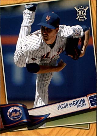 I’ll be honest — I left this off my initial list of options. An eagle-eyed voter noted its omission and I added it about an hour after the polls went live. Did that one hour suppress the vote totals for the newest set on the list? Doubtful. I sort of rolled my eyes when I added the option, thinking there was no way it would be picked over some of the other classic designs on the list, but sure enough, one brave voter saw it fit to vote for. This set was a really fun break, one I wrote about here last year. But design isn’t really its strong suit, in my opinion. The image is tilted — almost as if it’s intended to be a baseball card sitting on a table — and the wood grain is fairly light and a little too yellow. I will give the design props, though, for maintaining the wood-grain texture in the colored parallels.
4. 1958 Hires Root Beer (2 votes, 1.7%)
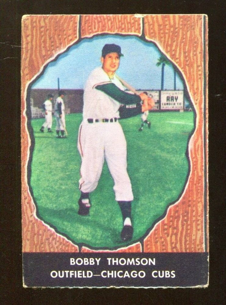
I’m not sure what the bigger surprise to me was: 2019 Big League actually getting a vote, or this set only receiving 2. If I voted, which I didn’t, it would have been for the ’58 Hires set. The card is designed so that the subject player appears in a knothole, a really unique and bold design choice for a set at that time. I wasn’t alive in 1958, but thanks to Norman Rockwell’s painting and the presence of “knothole gang” promotions run for children by minor league teams, I’ve always known that kids early in the 20th century would sneak a peek at baseball games for free through knotholes in the wooden fences. This design sort of romanticizes that, and it’s my personal favorite on the list.
3. 1955 Bowman (29 votes, 24%)
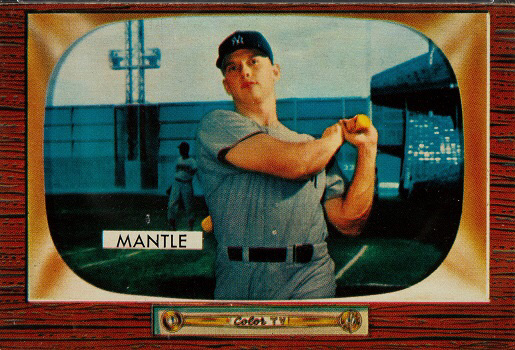
This is the earliest set on the list, and perhaps the first bold design choice made by a major card manufacturer. Just 2 years earlier in 1953, Bowman cards had such a simple design — literally just a photograph on the front — that they’ve long been admired for their simple aesthetic. In 1955, Bowman tried something completely different and, up until that time, unseen. Not only were all of the cards in the set oriented horizontally, but traditional white borders had been eschewed for a “Color TV” set placed around the photograph of each player. That TV set was designed to replicate the feature most real TVs had at that time: wood-grain paneling. The wood varies between light and dark depending on the card, which wasn’t intentional but does add a more realistic element to it.
2. 1987 Topps (44 votes, 36.4%)

The top 2 vote-getters were incredibly close, and the vote seemed to break down by collecting interest. In groups that were more strongly-associated with vintage card sets, 1987 finished 2nd, while in more modern-focused groups it was the leading vote-getter. This seems to correlate with the memories collectors have of the set; one voter included a photo of the B.J. Surhoff Future Stars card and noted, “I was 7 years old and spotted this card. 1987 Topps for Life!” The ’87 set was almost certainly a nod to the 25th anniversary of the 1962 set’s borders, but the two are very different. The wood in 1987 was light and had so much texture it looked unfinished — in the wrong light, you could have convinced me that handling the cards would give me a splinter.
1. 1962 Topps (45 votes, 37.2%)
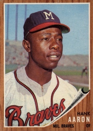
Just barely edging out the ’87 set was the original Topps bad boy, 1962 Topps. As noted above, this set was the first to feature a border other than white. For my money, ’62 does edge out ’87, albeit slightly, so this single-point victory feels right to me. The 1962 set has a rich, dark, elegant wood border; if 1987 reminds me of unfinished furniture, the 1962 design reminds me of the fancy dining room table at my grandmother’s house that I was DEFINITELY not allowed to put a glass on without a coaster. The bold design choice borrowed from Bowman’s swan song above, but in a more traditional way, keeping cards oriented vertically and including the typical Topps stats on the back as opposed to the narrative on Bowman’s ’55s. Although my vote would have gone to the 1958 Hires set, that was always a dark horse, and this is a worthy choice for the best set with a wood-grain border.
